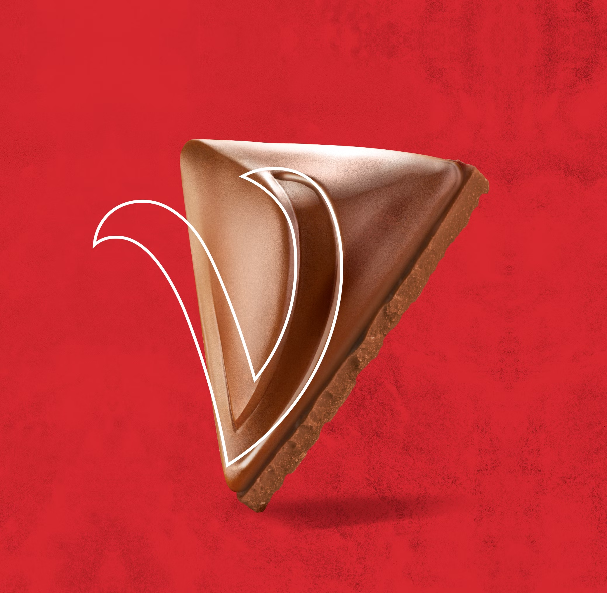
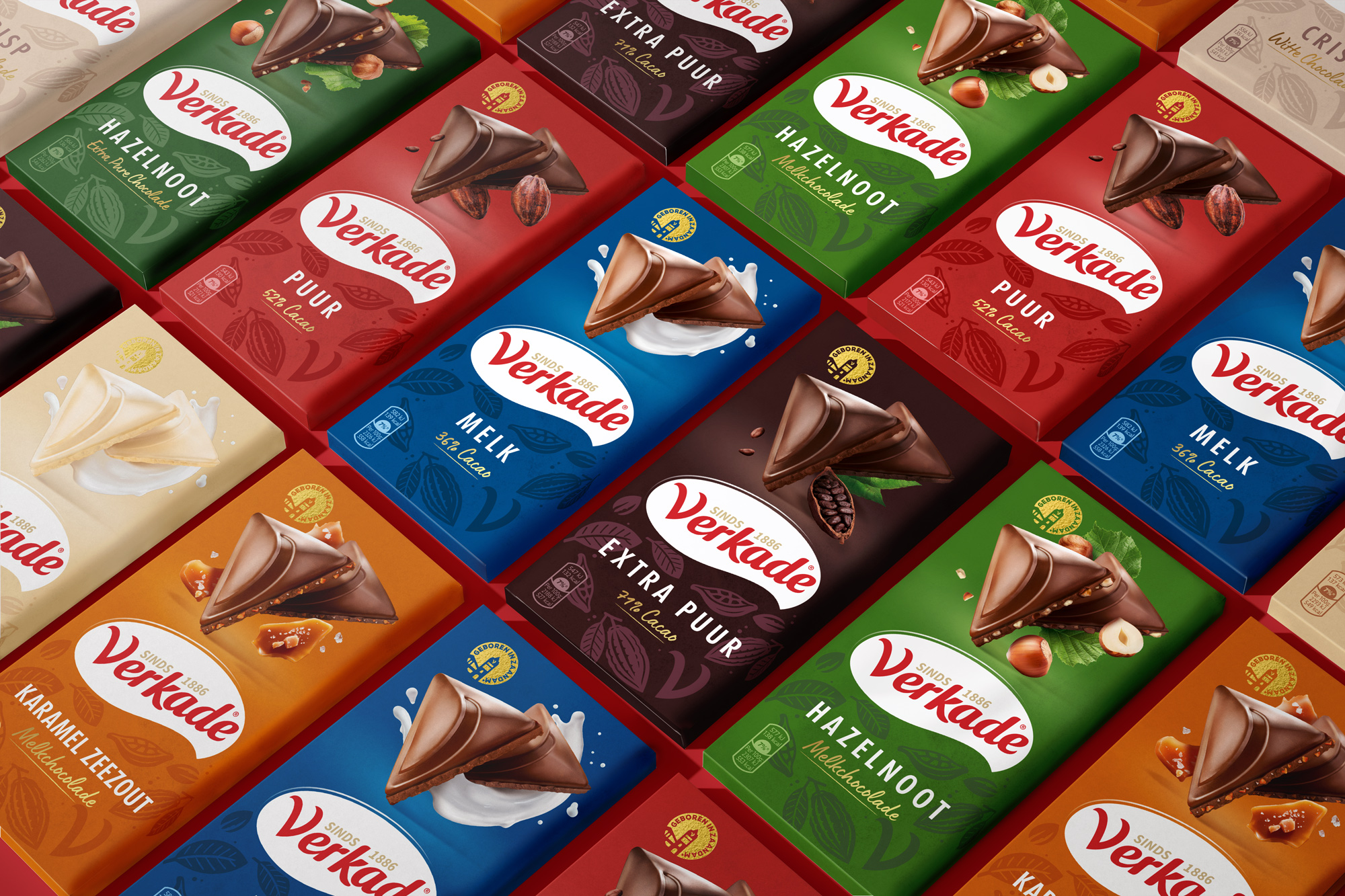
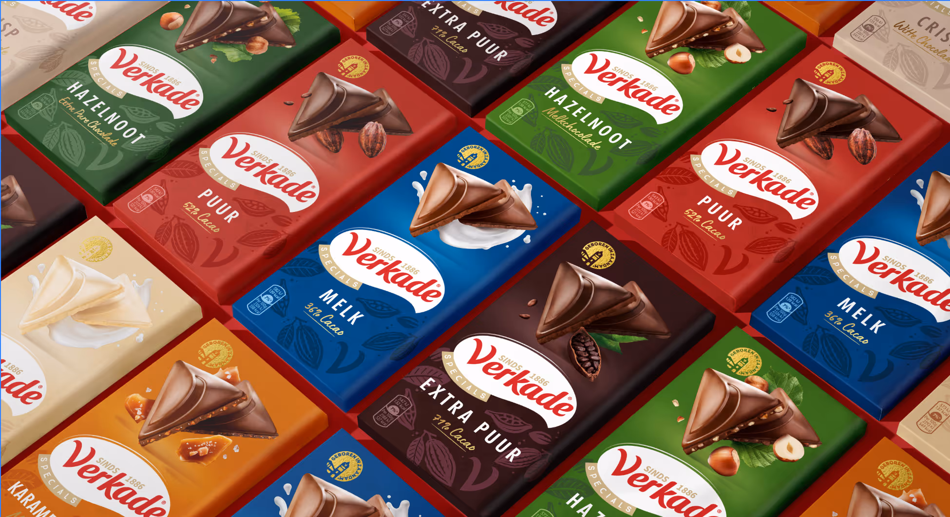
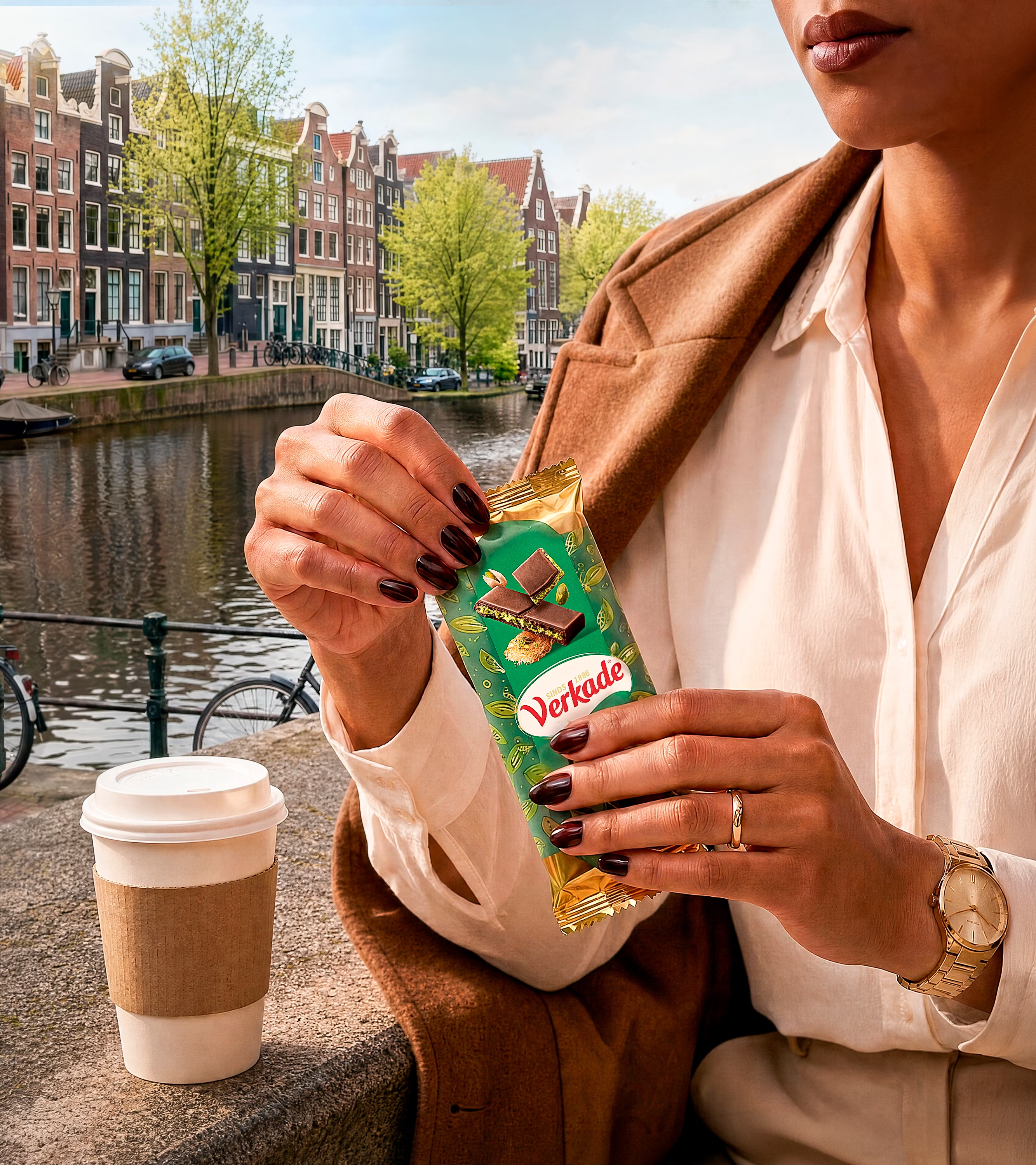
Verkade ist seit Generationen fest in der niederländischen Kultur verankert – vertraut, geliebt und mitten im Leben. Doch selbst Ikonen müssen sich weiterentwickeln. Wir haben das neue, prägnante „V“-Markenzeichen direkt in die Schokolade integriert. Es ist mehr als nur ein Designelement: Es intensiviert den Genuss und schafft eine unverwechselbare Haptik, die man schmeckt und fühlt.
Shaping a
Dutch icon.

Love Brand-Potenzial,
entfaltet.
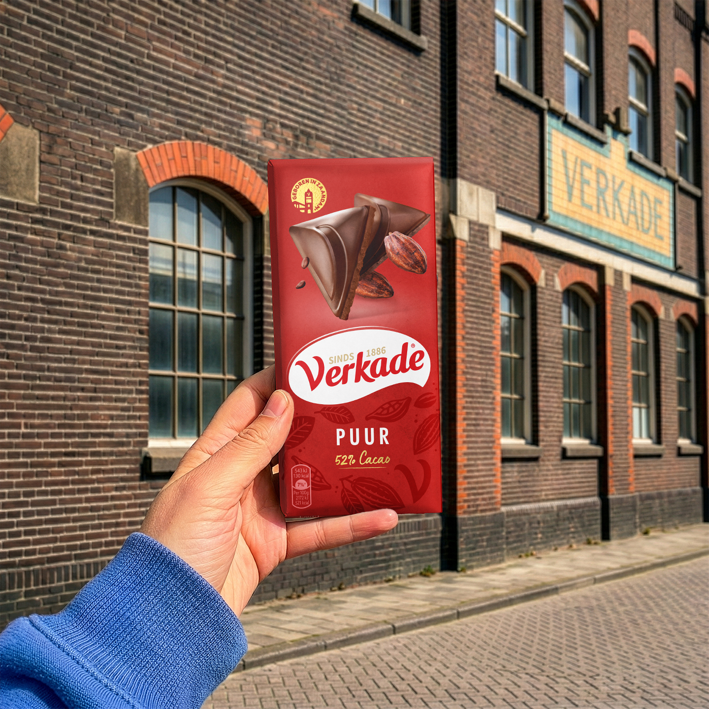
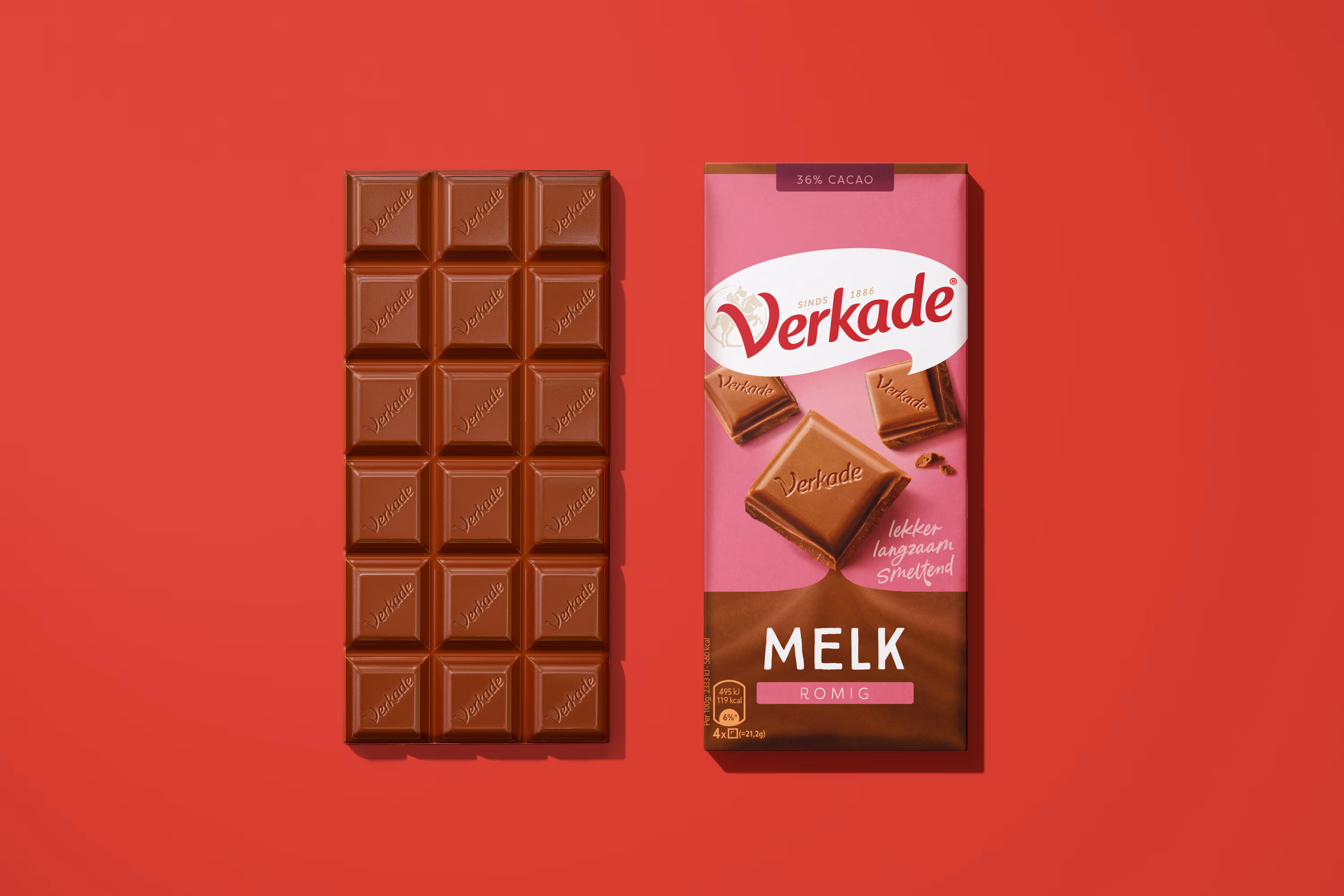
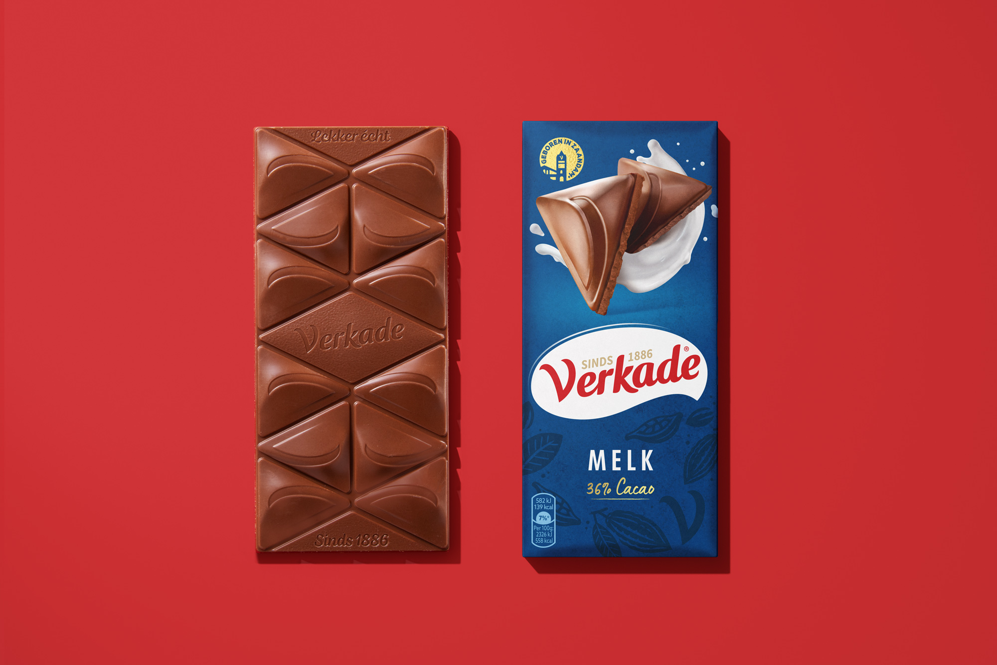
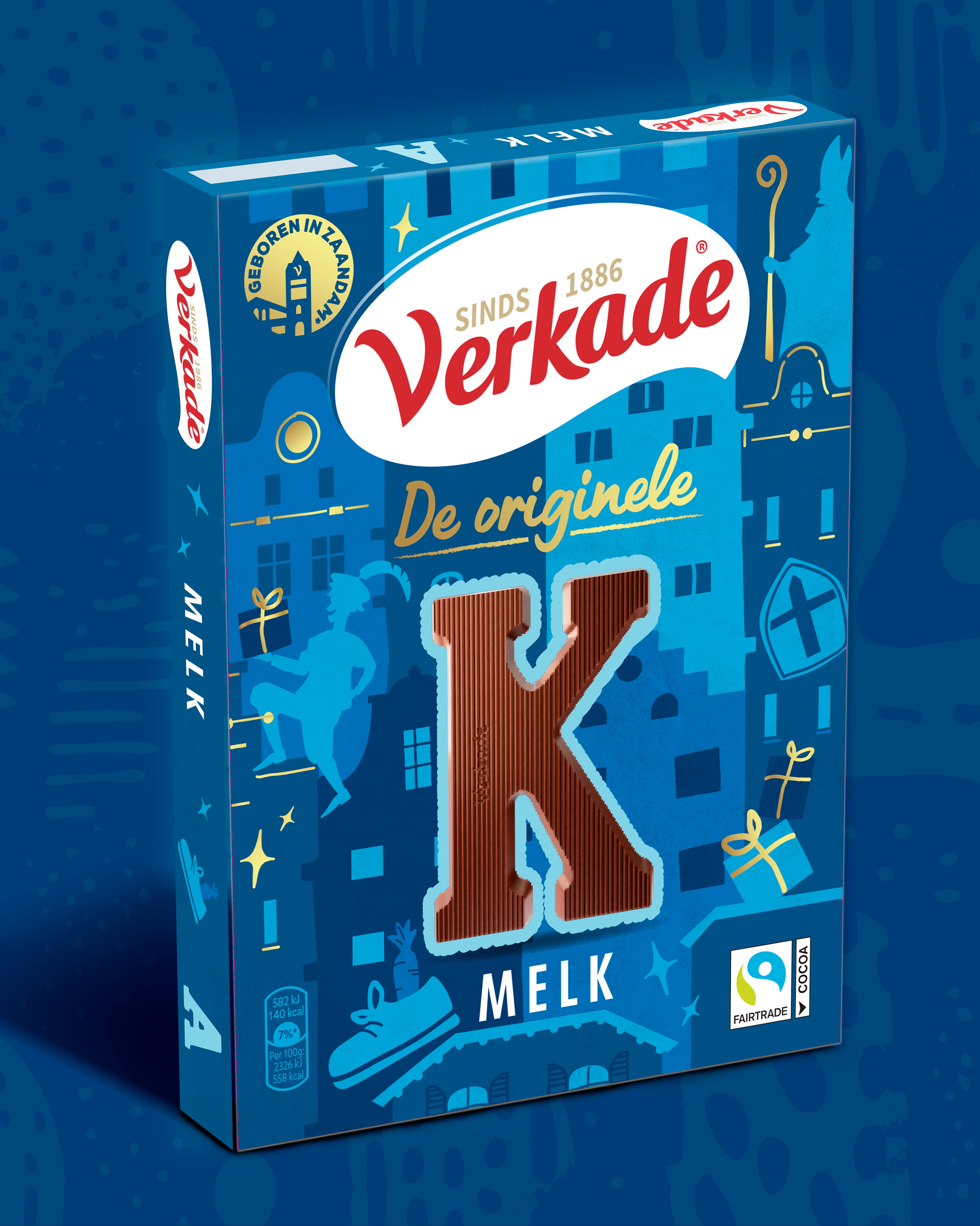
Mit mehr Stand-out des Verkade-Logos – klarer, kraftvoller und bereit für das Regal von heute. Mit Schärfung der Sprechblasenform im Kontrast mit dem Verkade-Rot für mehr Wirkung am Point of Sale.Und mit starken nonverbalen Key Visuals, die den Geschmack in den Mittelpunkt rücken, während das neue Siegel die Heritage der Marke in Zaandam feiert.
Eine niederländische Ikone neu geformt.
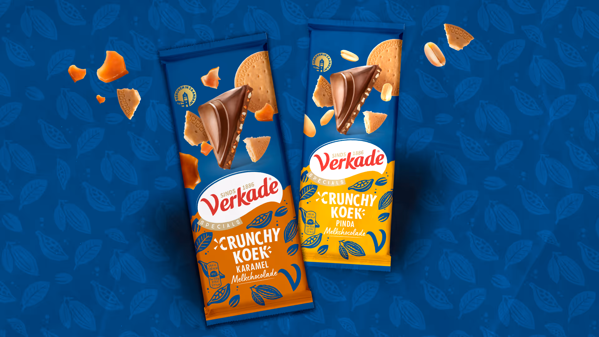
Mit dem neuen Claim „Lekker Écht Sinds 1886“ im Zentrum haben wir den authentischen niederländischen Charakter und die echte Genussqualität von Verkade zurück ins Rampenlicht geholt. Getragen von einem kraftvollen neuen Brand Design.
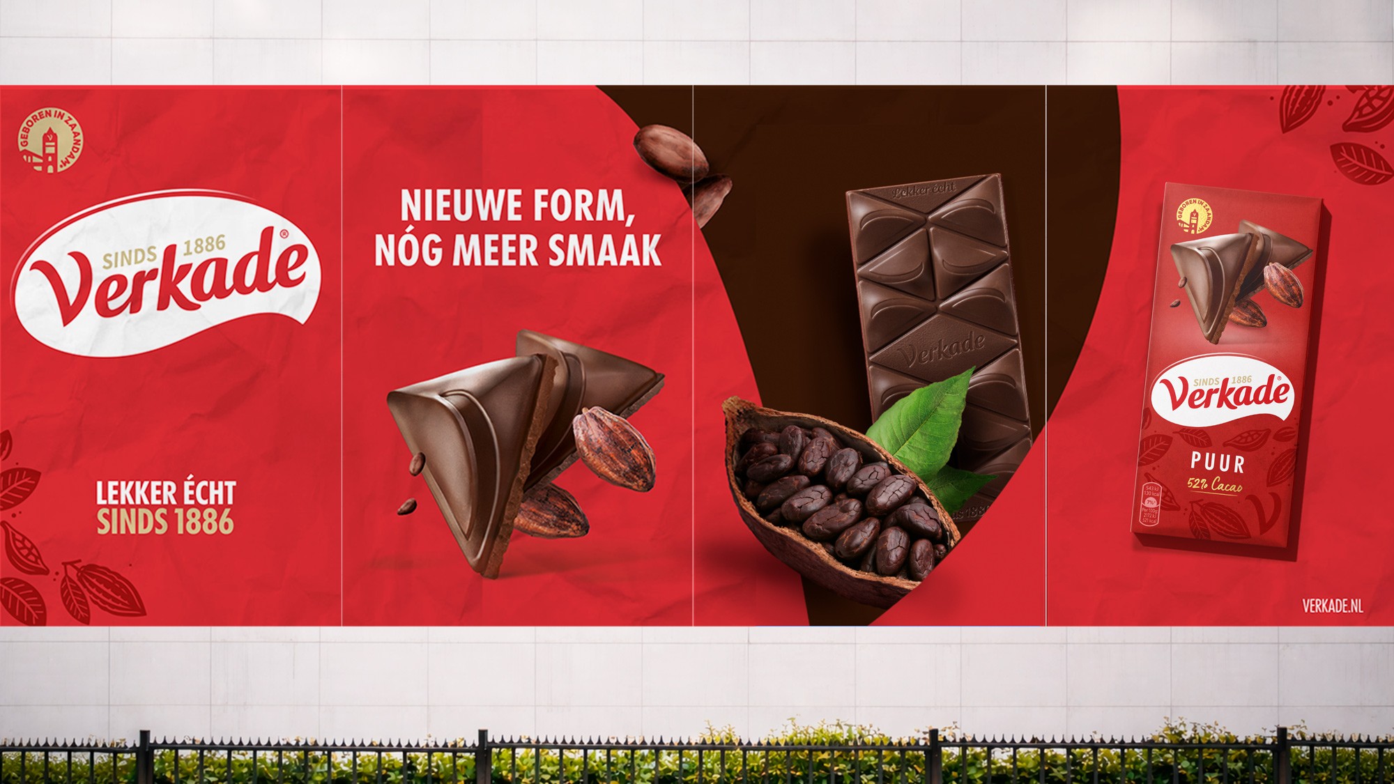
Ehrlich. Echt.
Typisch niederländisch.


(YDT , Nielsen P3 2026)
von 8,4 % auf 15,7 %
(YouGov MAT Q1 2026)