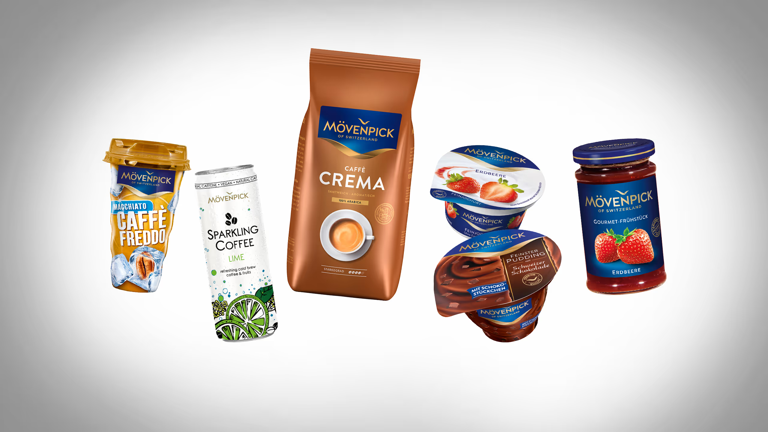
Mövenpick steht seit vielen Jahren für Qualität. Aber die zunehmende Fragmentierung in den verschiedenen Produktkategorien führte zu einem inkonsistenten Markenauftritt.

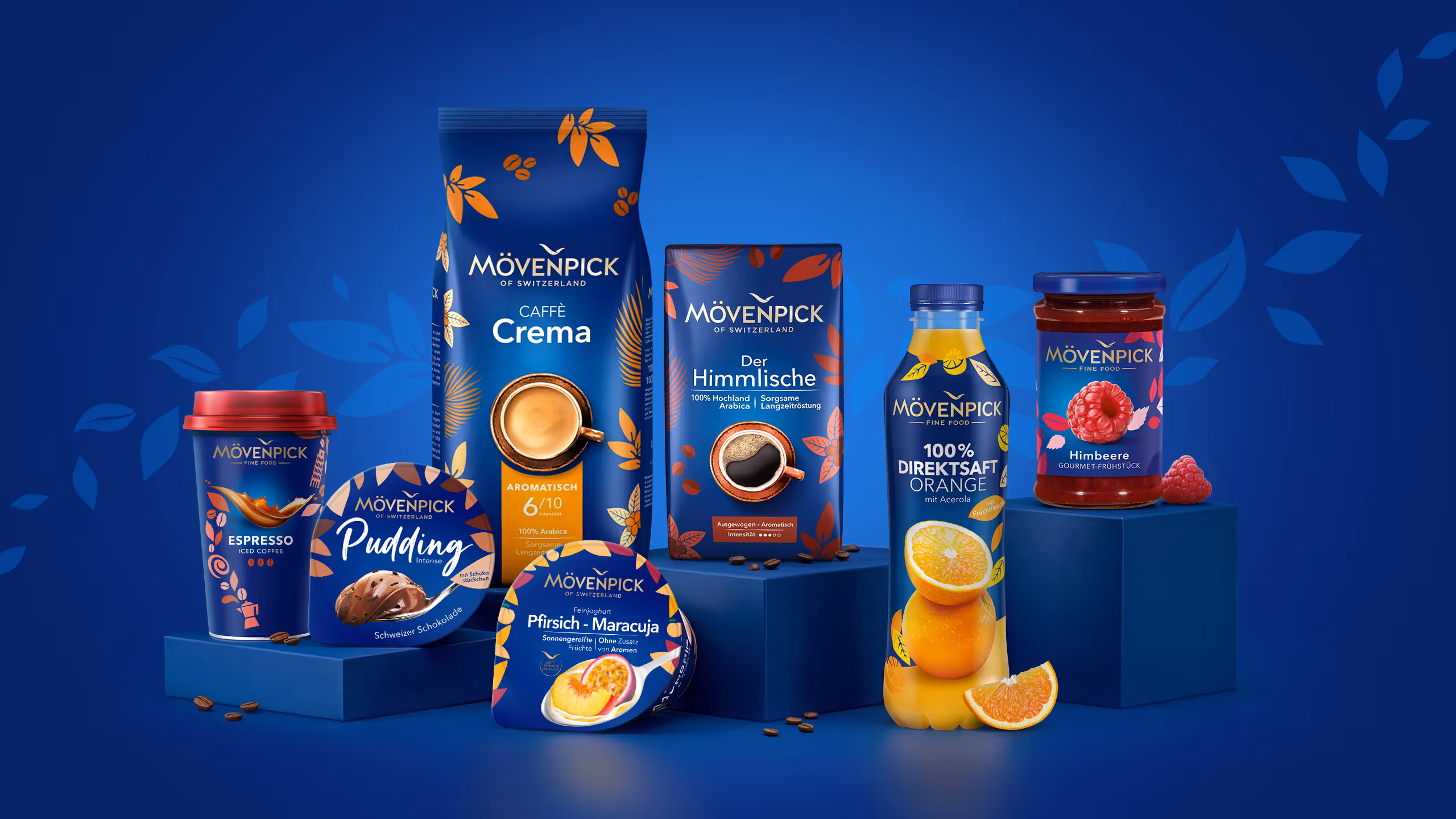
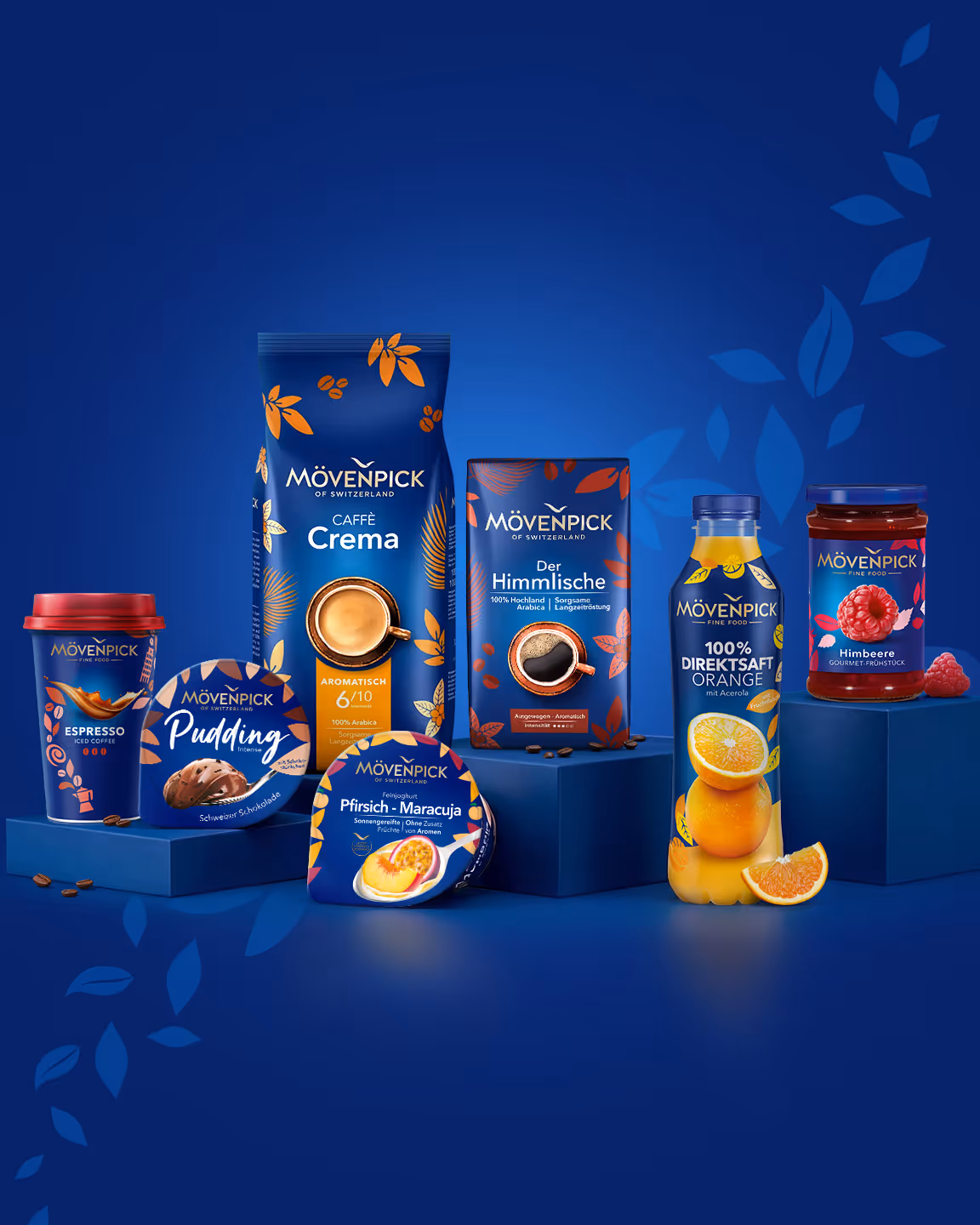

Abheben in Horizon Blue.
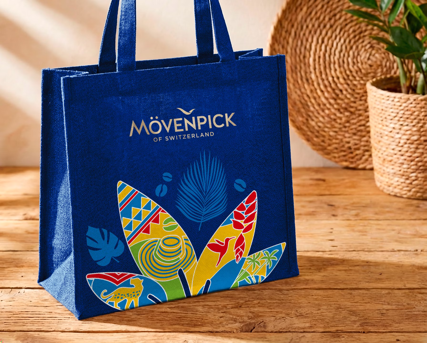
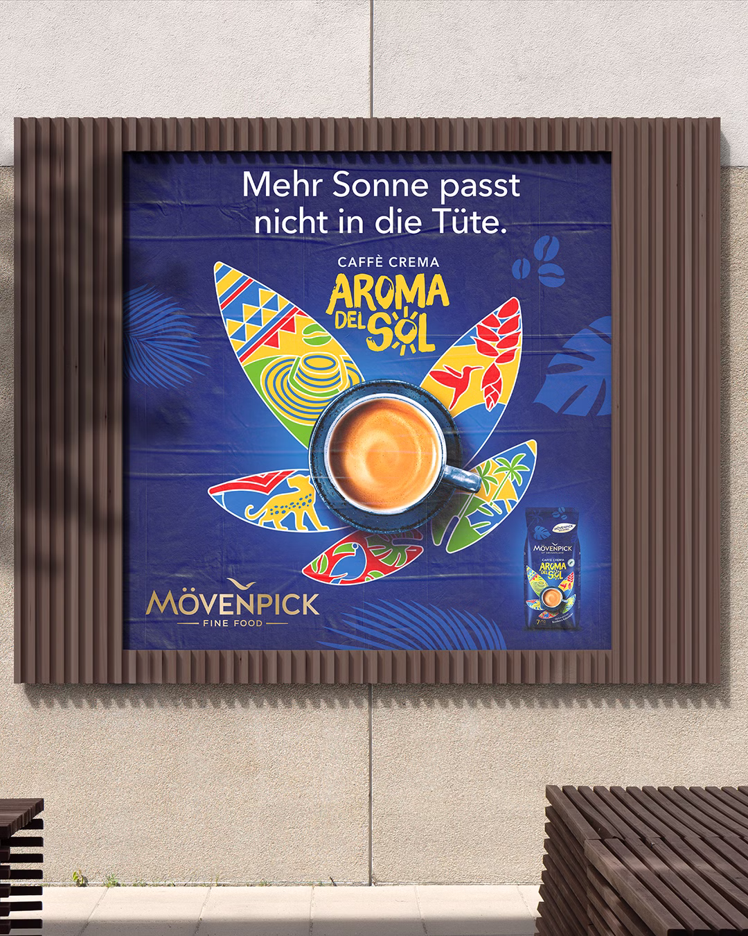
Unsere unverwechselbaren Markenelemente bilden die Grundlage für eine neue Ära von Mövenpick. Wir haben die Marke fest in ihrem einzigartigen „Horizon Blue“ verankert und durch unsere sich stetig wandelnden, farbenfrohen „Flavicons“ eine ganzheitliche und konsistente Markenwelt geschaffen.
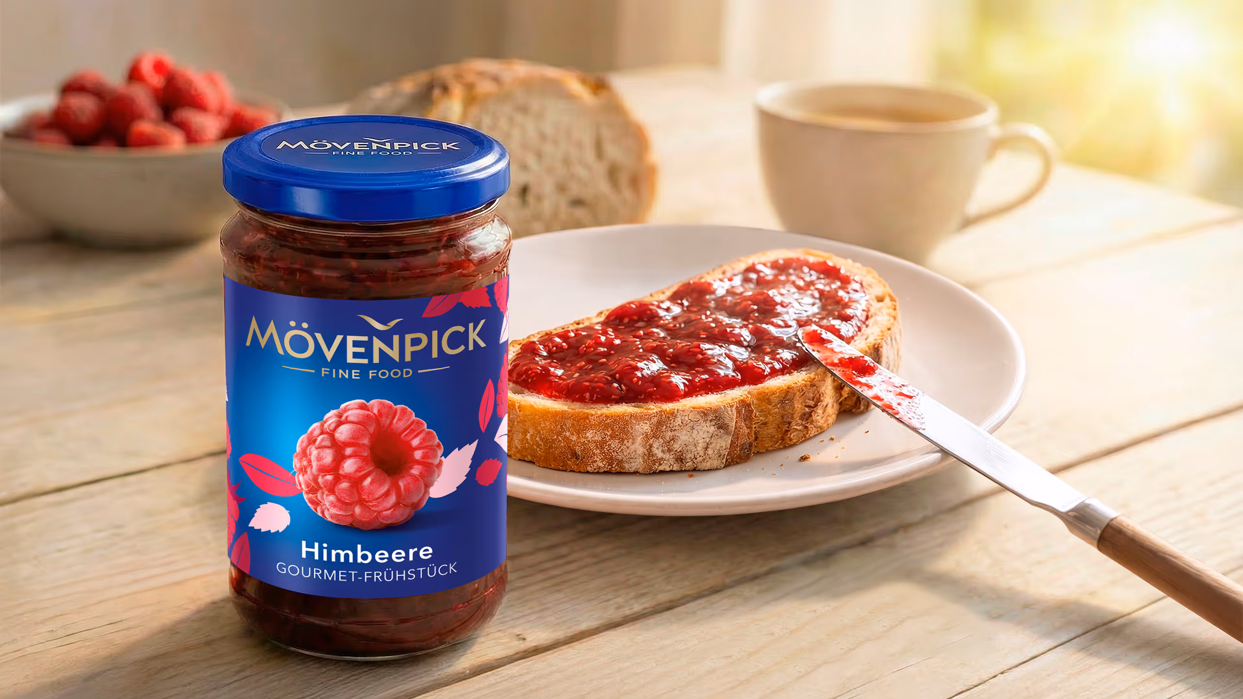
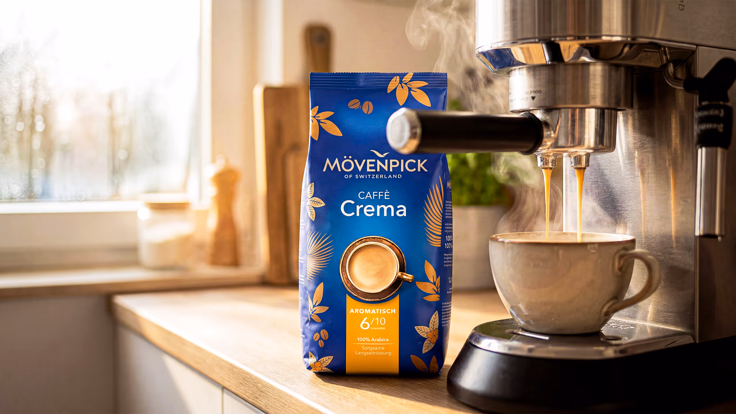
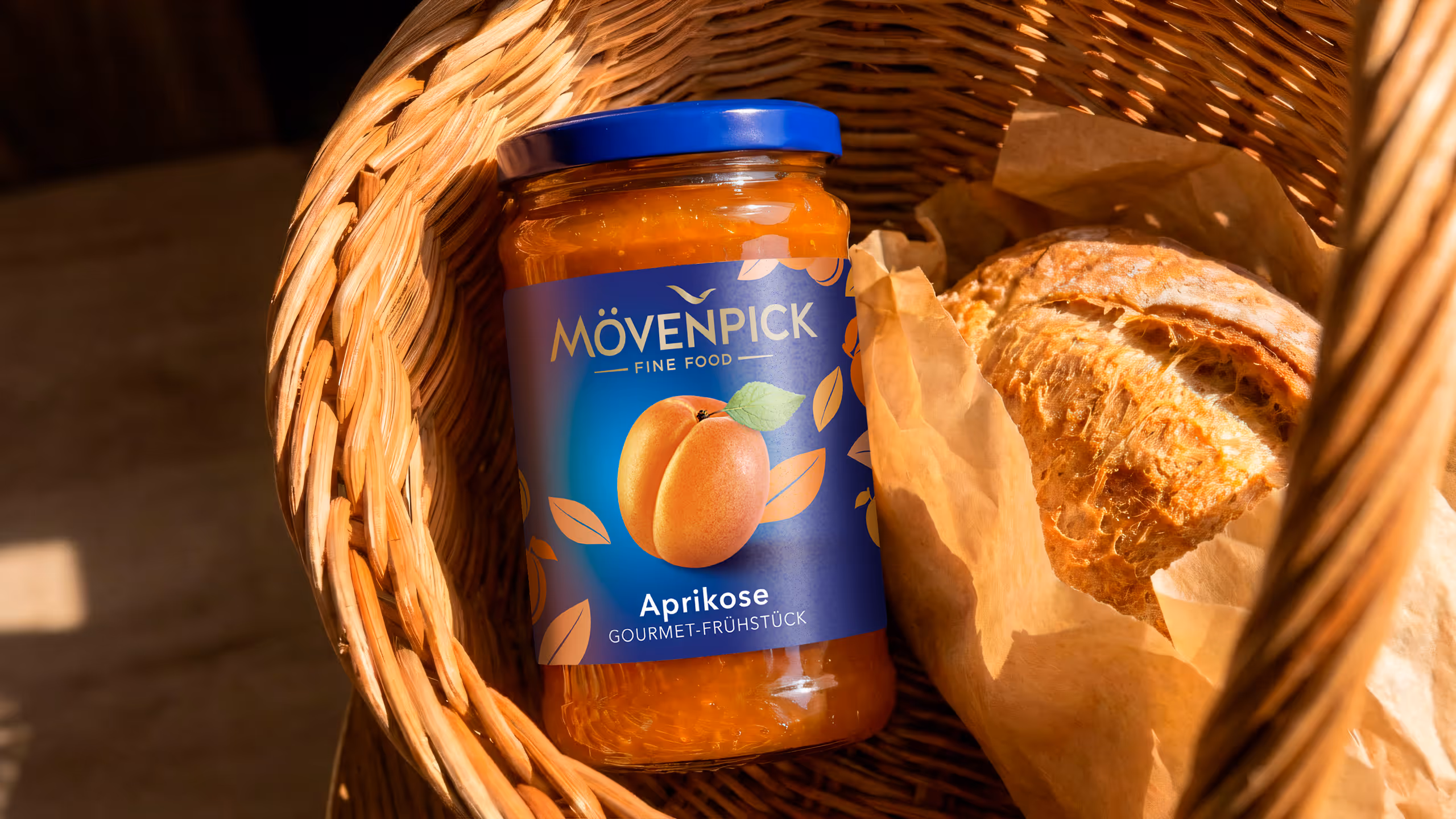
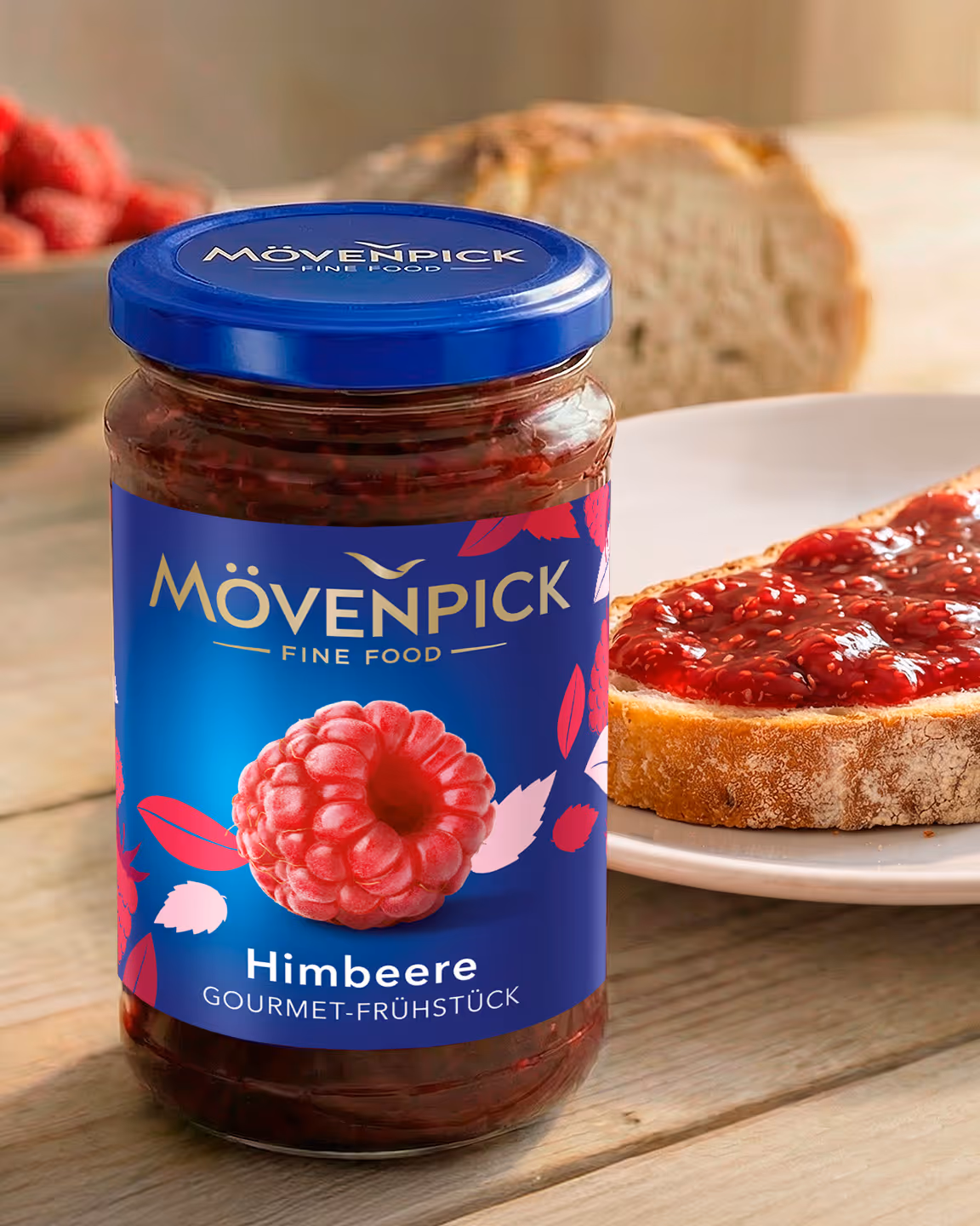
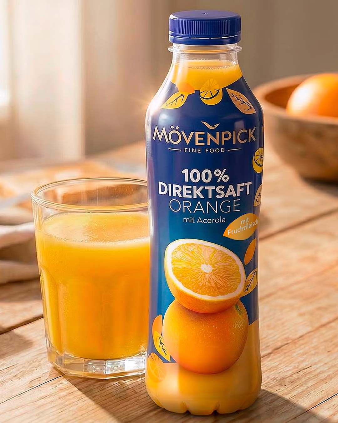
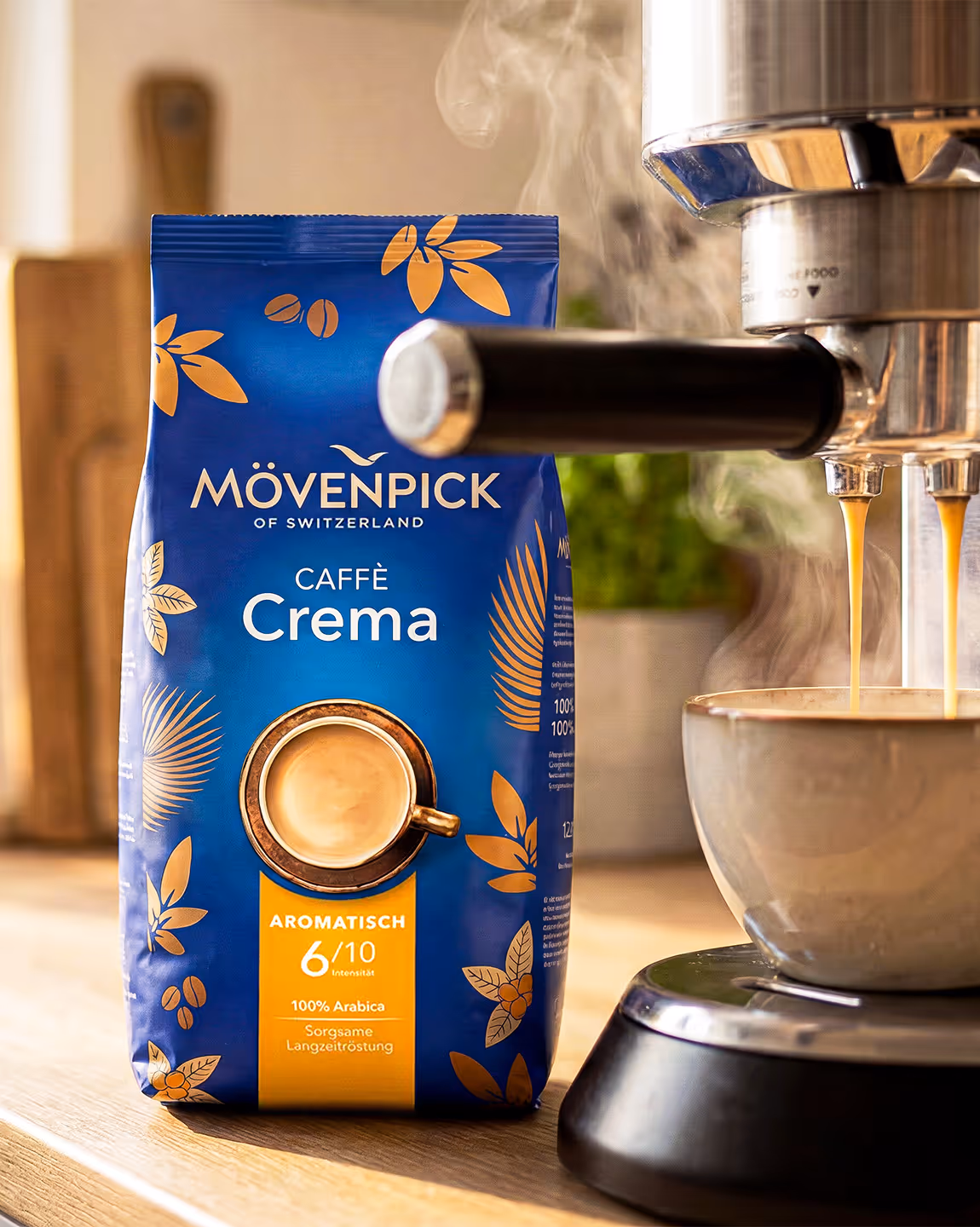
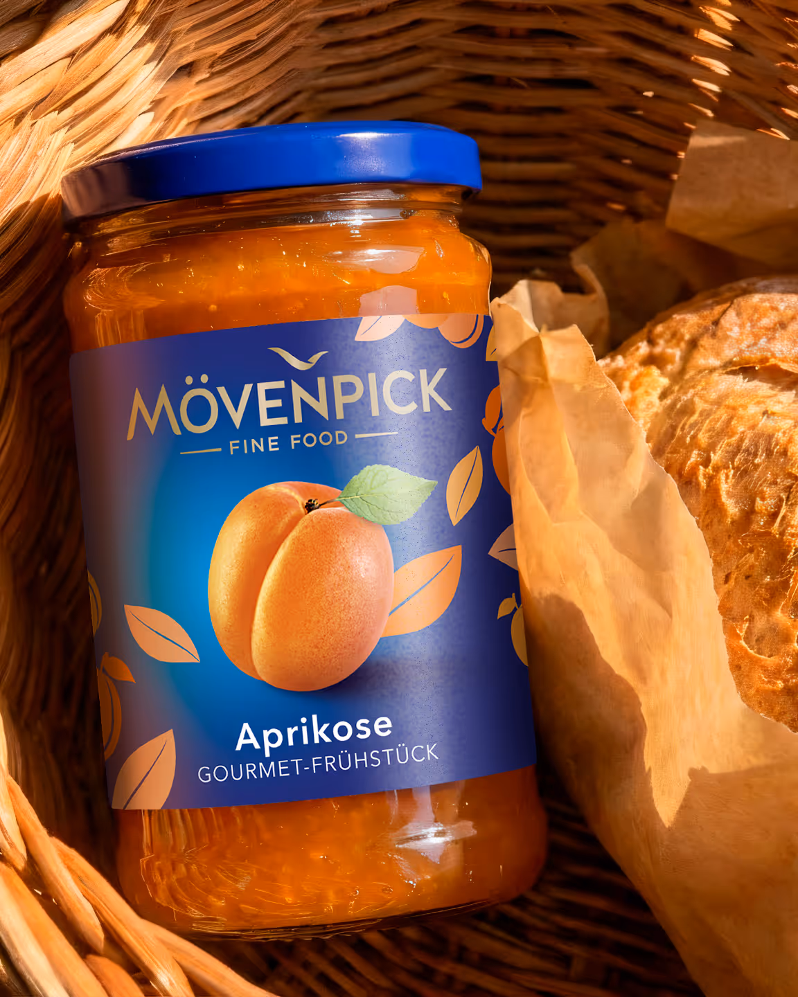
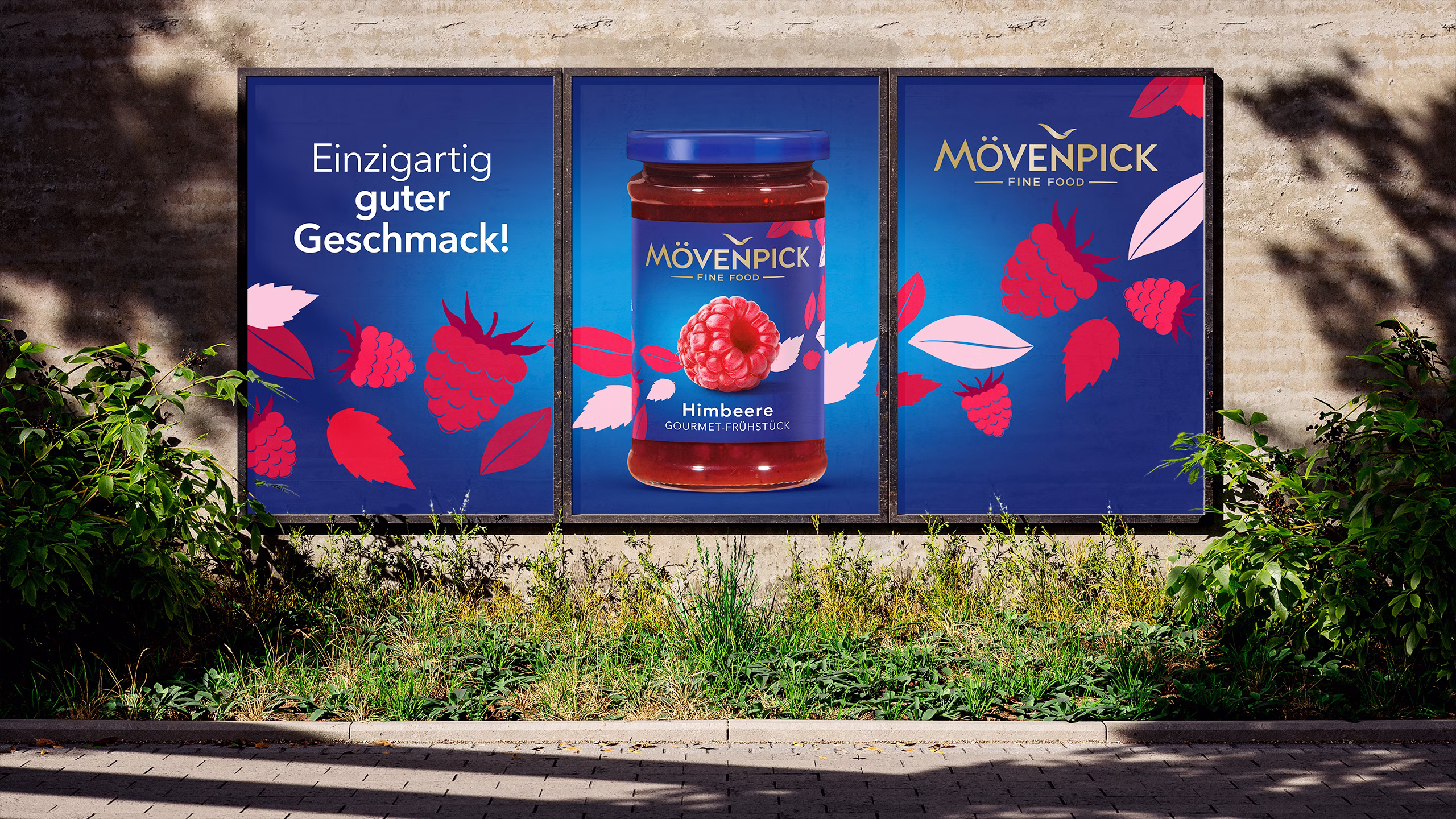
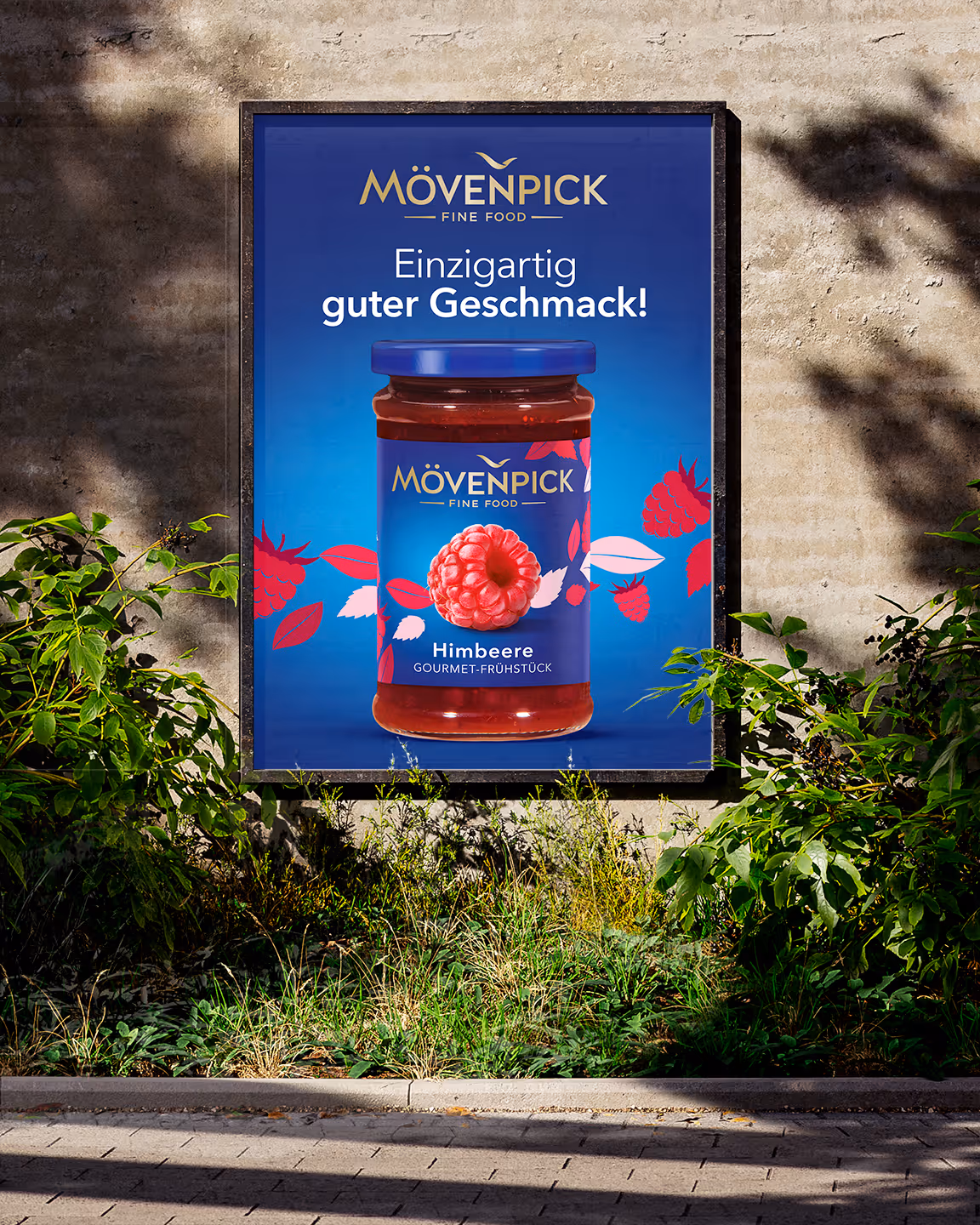
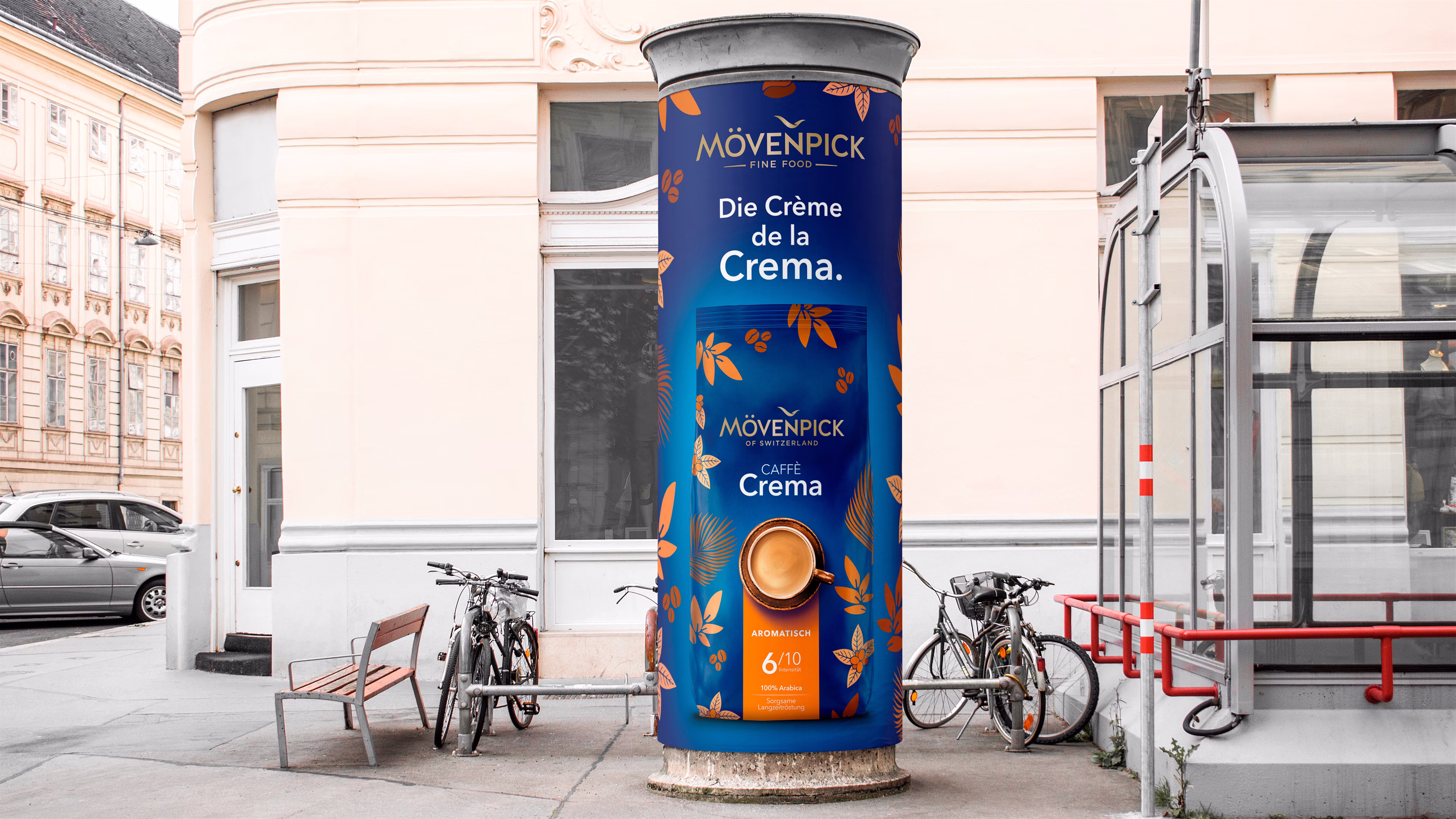
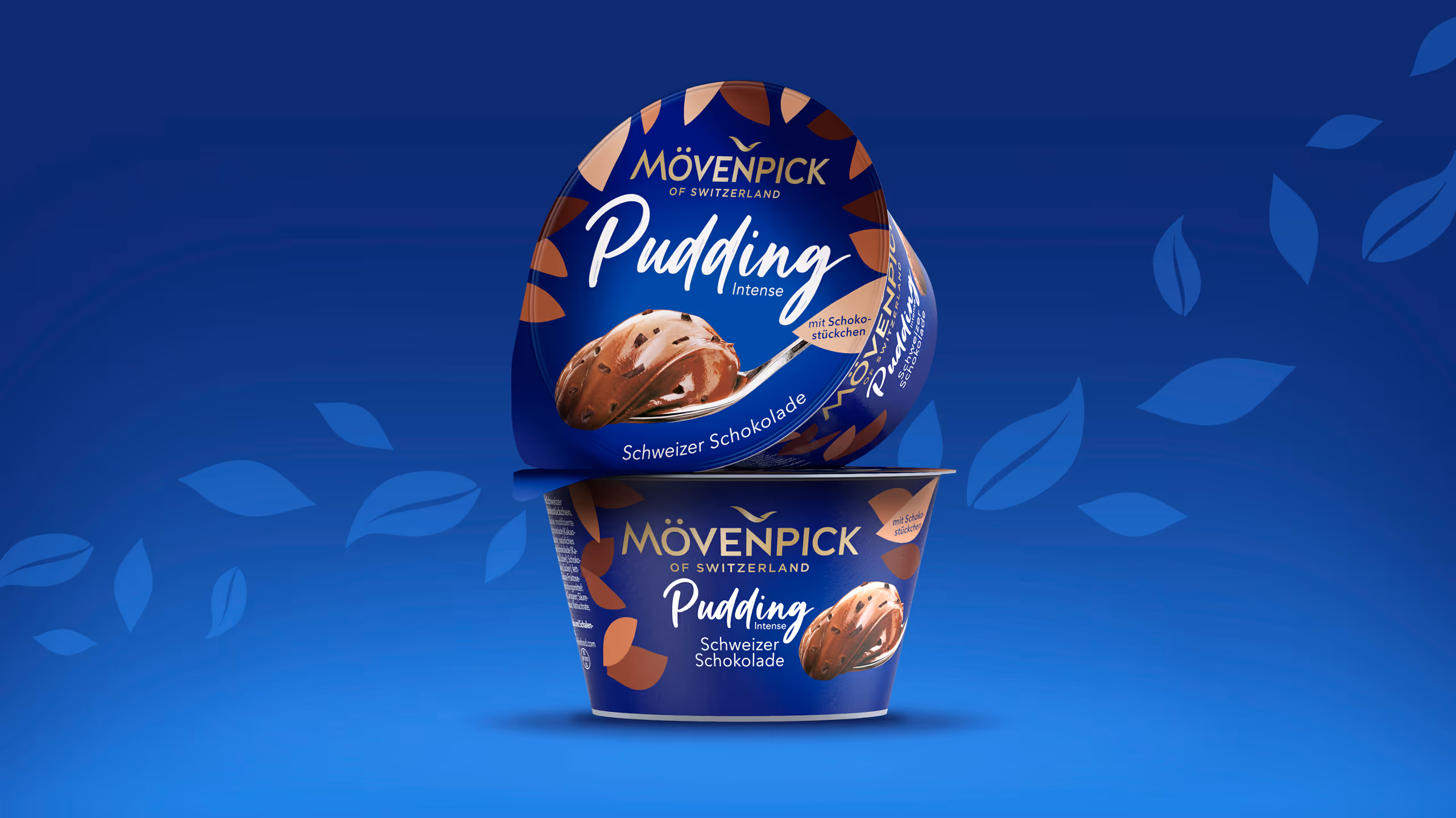
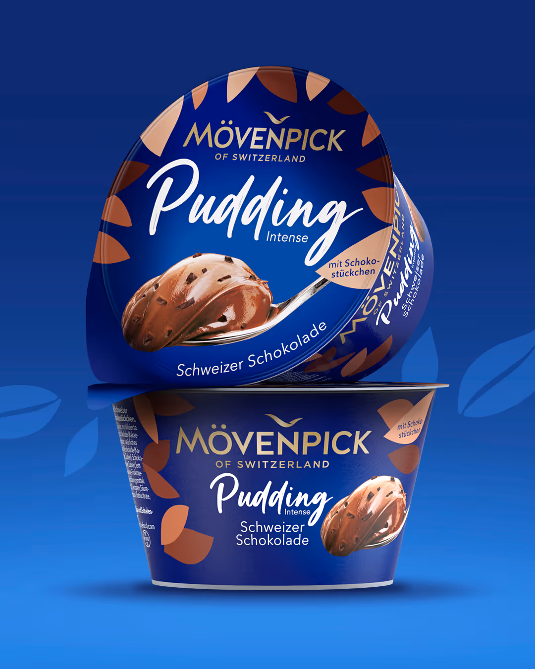
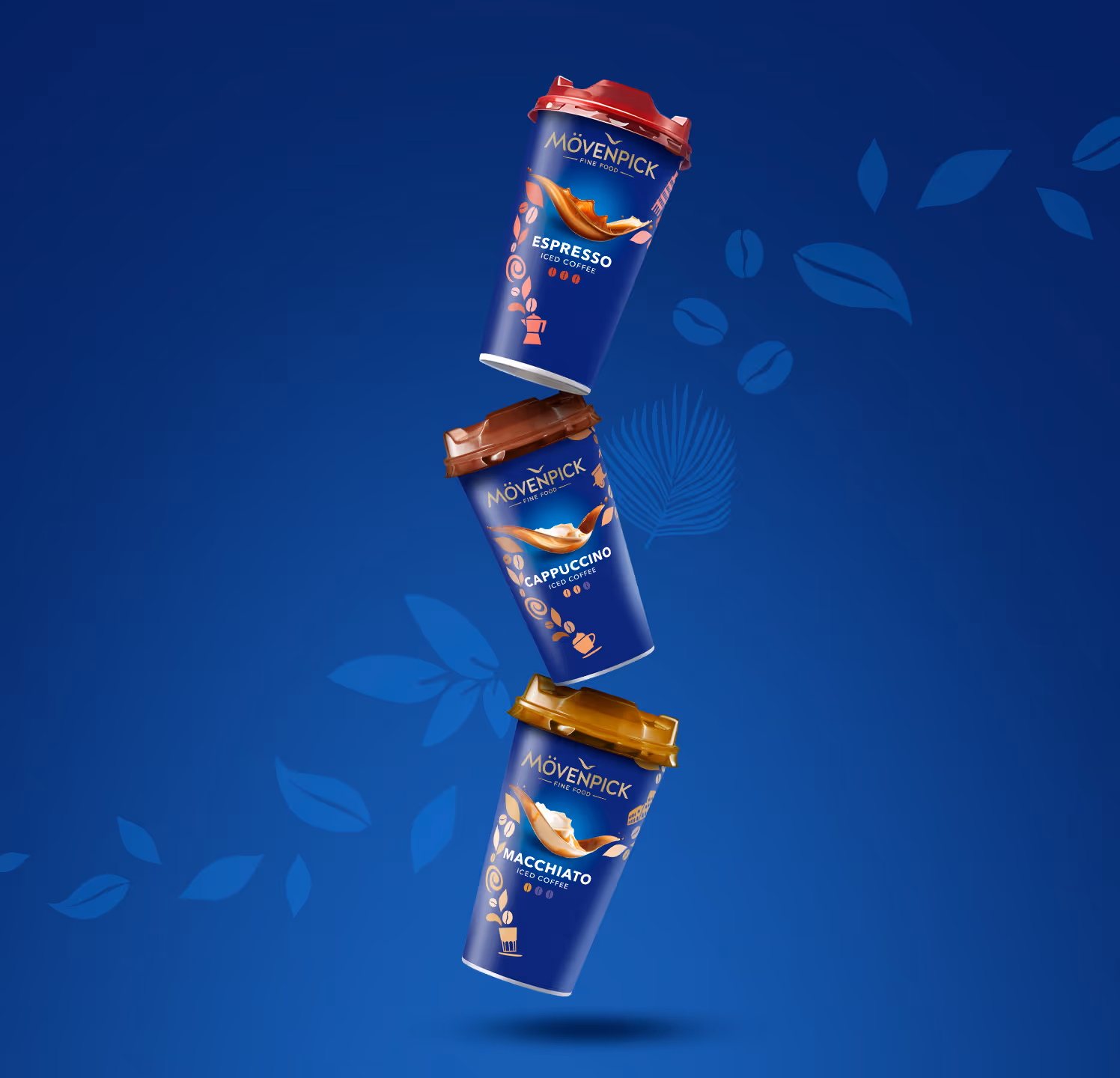
Ein himmlisches Geschmackserlebnis.
Jedes Produkt im Mövenpick Sortiment erzählt seine eigene Geschichte von erstklassigem Geschmack. Unsere nonverbalen Key Visuals in der Hotzone verbinden Genuss und Storytelling auf perfekte Weise – und lassen dich dem Alltag entfliehen.
.avif)
.avif)
.avif)
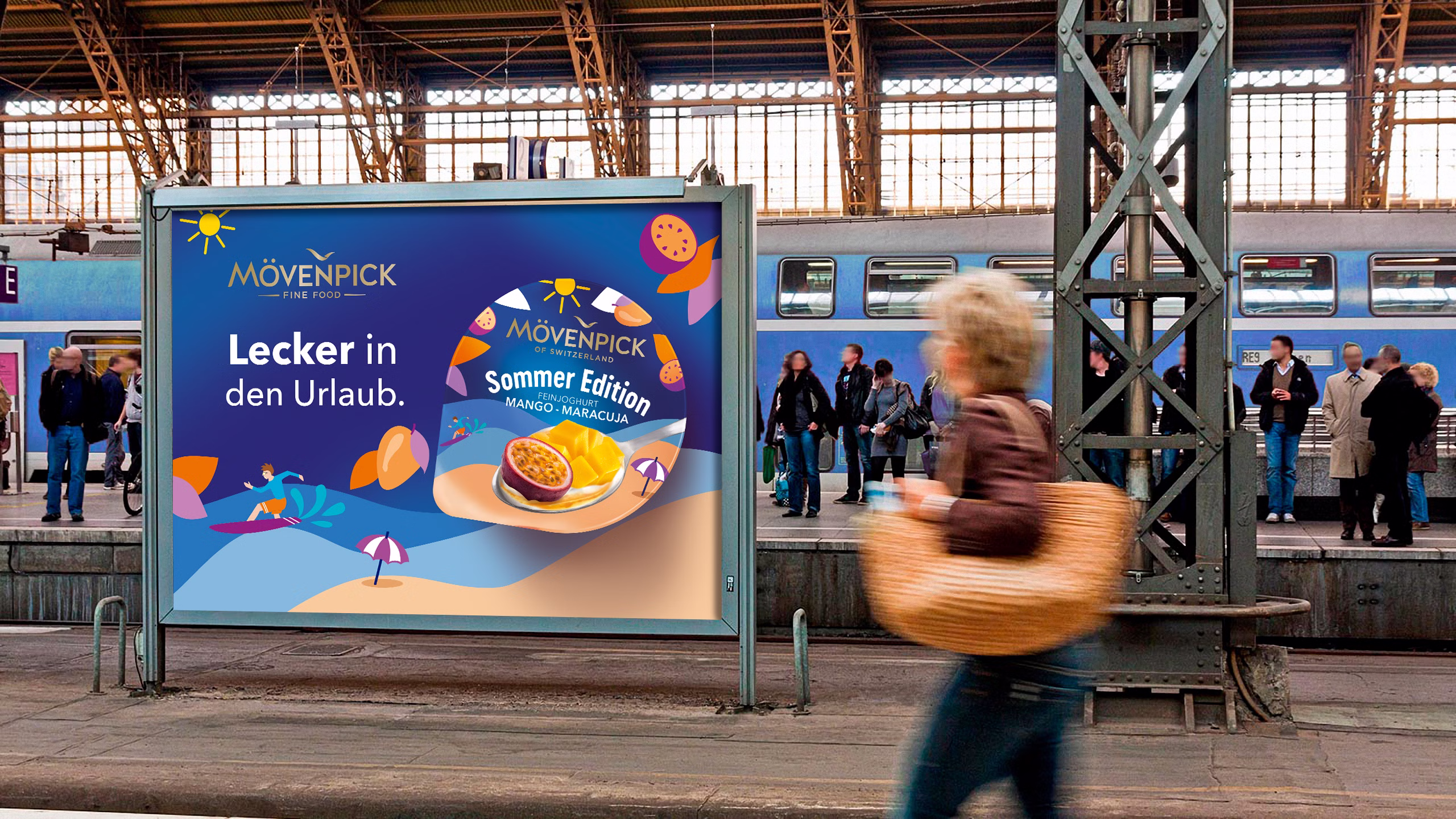
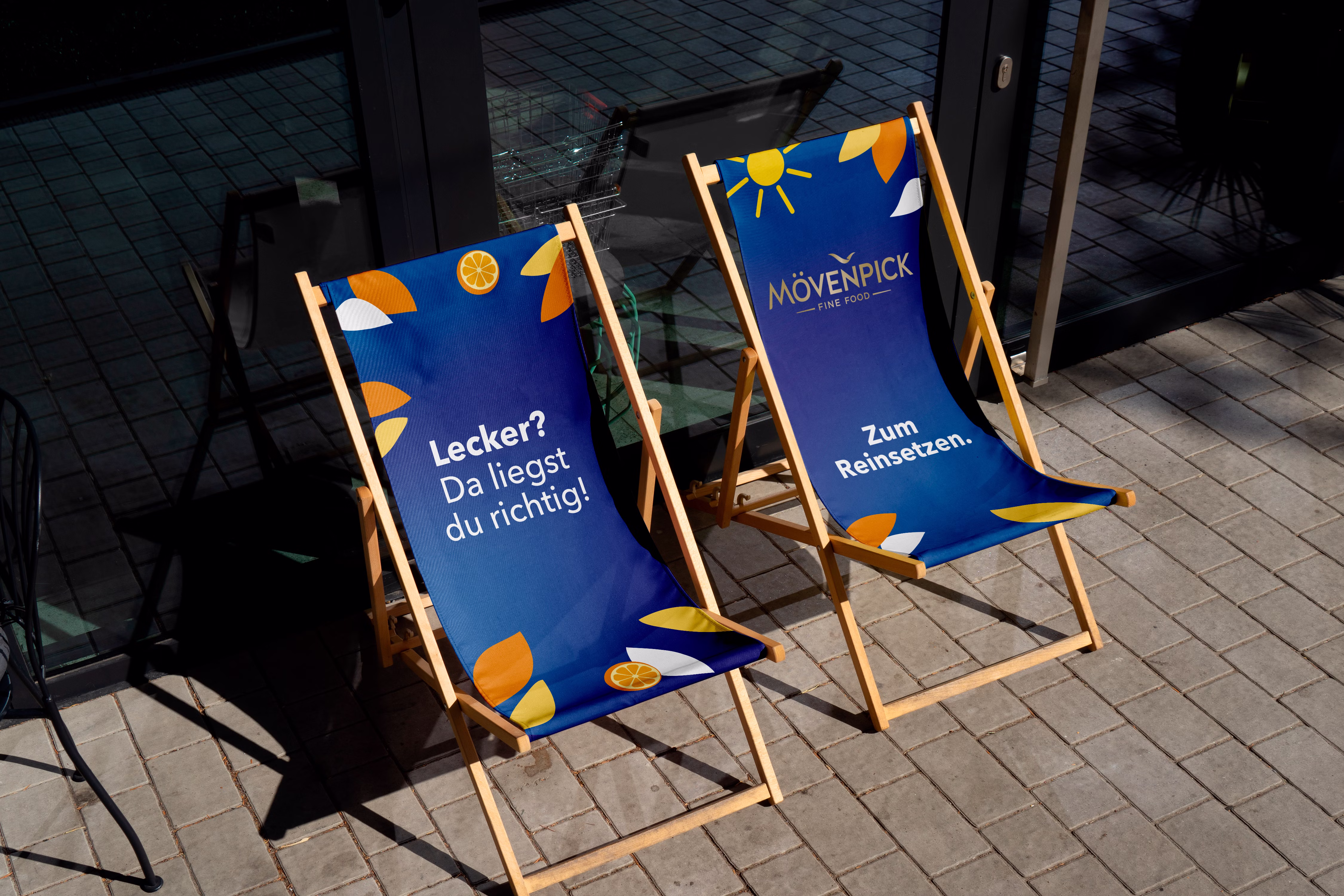
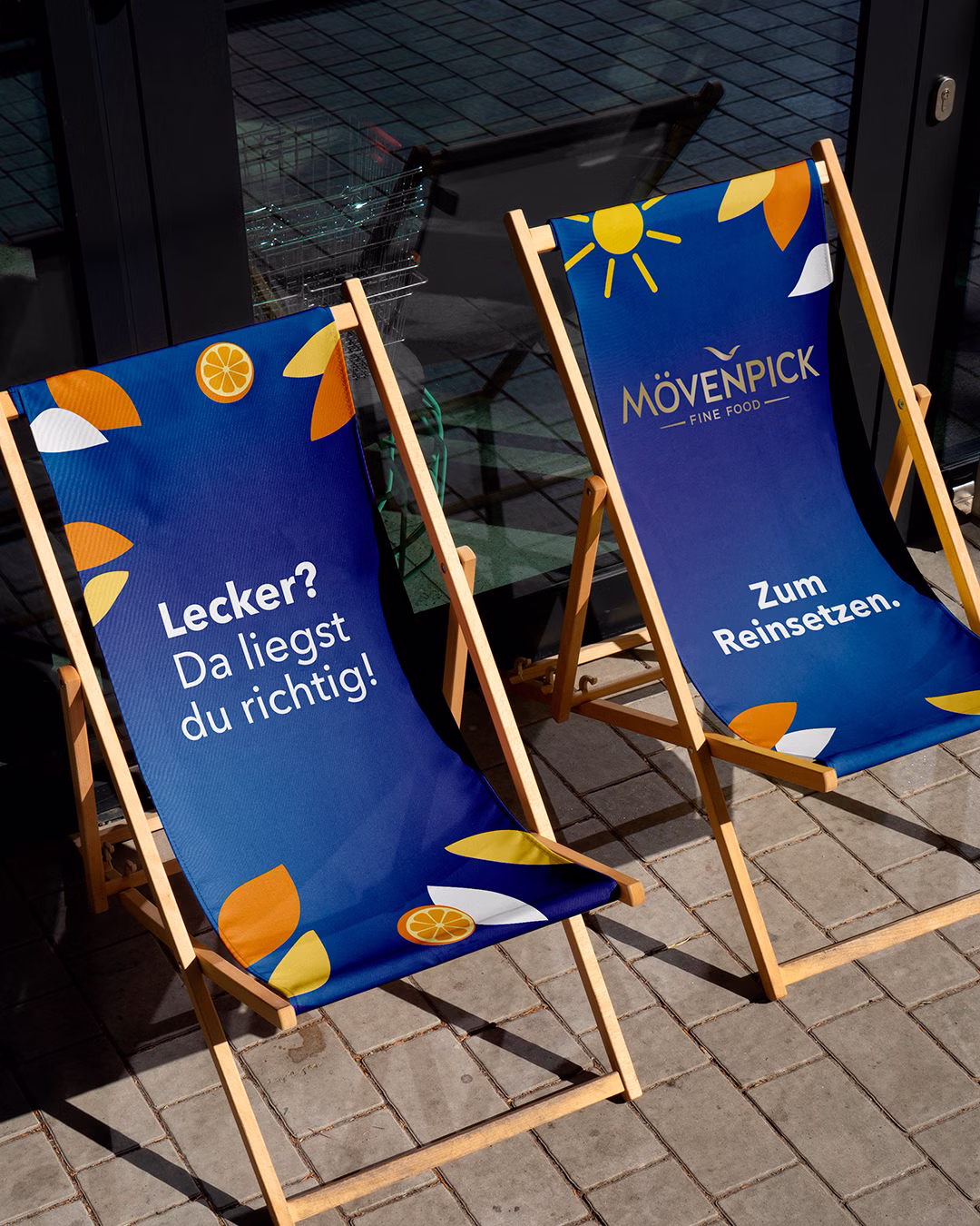
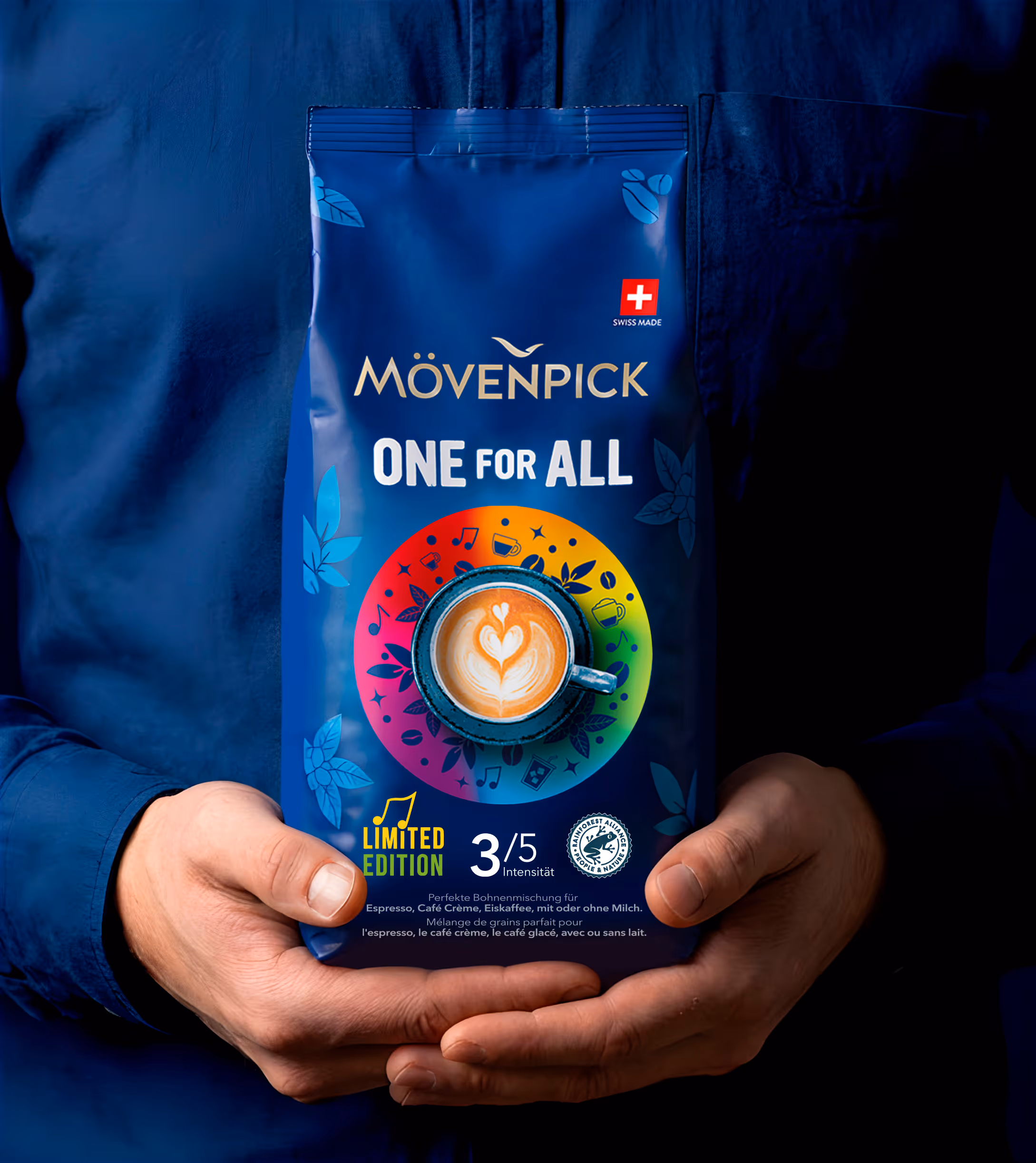
Eine Marke. Unendliche Möglichkeiten.
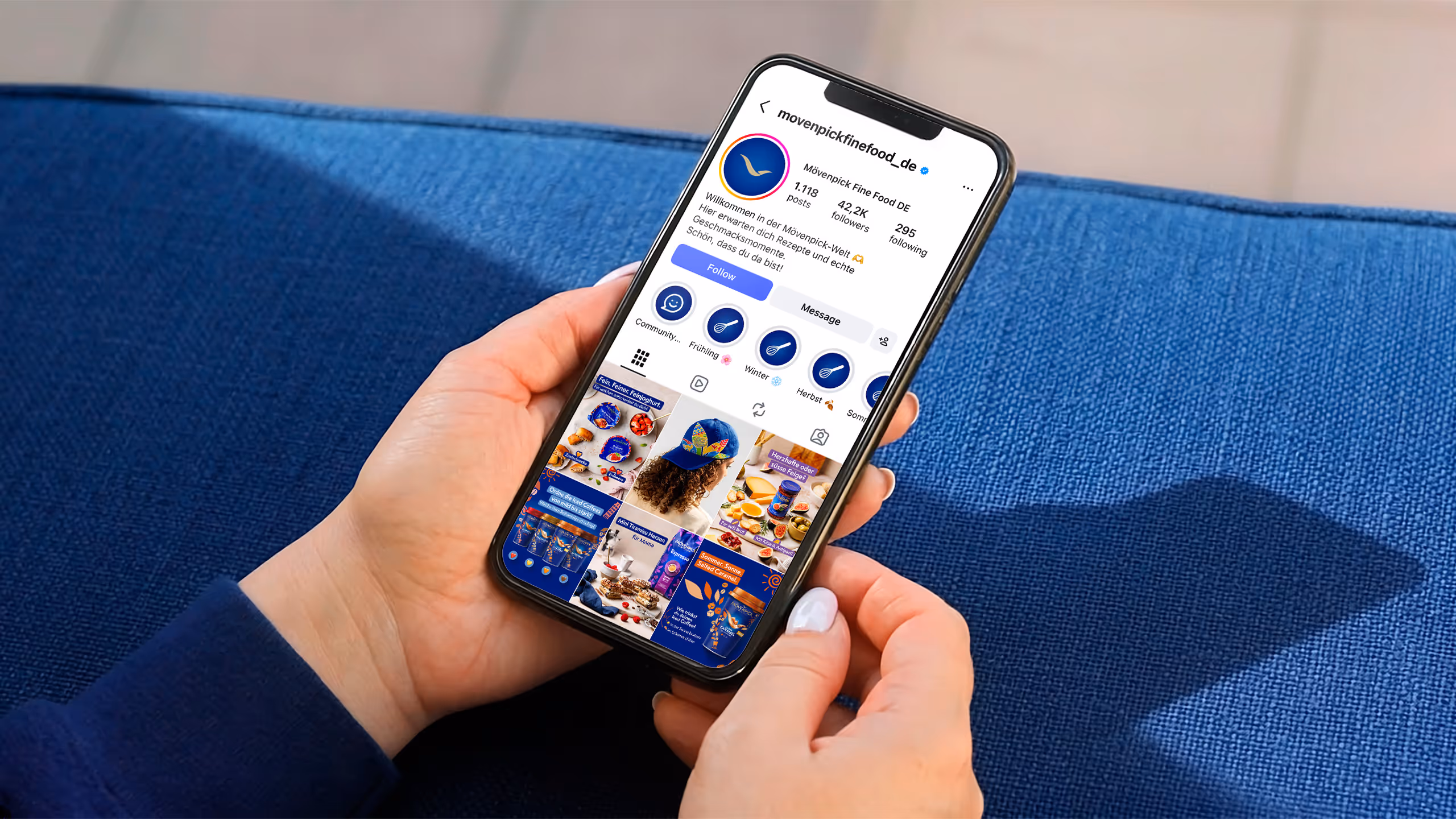
Unsere Markenelemente sorgen für einen konsistenten Auftritt, und zwar überall dort, wo die Marke erlebbar ist. Über alle Touchpoints hinweg entfaltet sich diese einheitliche visuelle Sprache.


Wo Erfolg über sich hinauswächst.
Die Wiederbelebung der Marke hat ein kontinuierliches und beeindruckendes Wachstum angestoßen. So ist Mövenpick heute in mehr Kategorien vertreten als jemals zuvor.
Fine Food hinweg
(Quelle: Nielsen IQ / Circana)
Fine Food hinweg
(Quelle: Nielsen IQ / Circana)